
Infographic Statistics
Page Contents
Introduction
Infographic Statistics: An infographic is termed an information graphic, which is a visual representation of data aimed at making the information understandable. These are specially used to deliver messages faster, allow for the identification of several links and trends in data, make complex data presentations more understandable, and also track changes in different factors. It is a great marketing tool for informing people about products and services or just offering information. 39.7% of US marketers use online graphic designing instruments for creating visualized infographics. This article includes many insightful statistics from various aspects that will prove the importance of the topic.
Editor’s Choice
- 25.6% of U.S. marketers preferred in-house designers for infographics in 2022.
- 16.7% of businesses have already implemented advanced design software.
- 17.9% of companies use independent designers to produce visual content.
- An infographic has a 30x greater chance of being read than an article with the same subject matter.
- This is used to increase reading motivation by 80%.
- Infographics have been used in content strategy by 60% of U.S. business firms.
- 87.5 % of U.S. marketers have started blogging with infographic statistics resulting beneficially.
- 85.7% used blog that includes more than 80% of infographic visuals, 9.2% said (50-80%) of their blog contains at least 1 visual infographic and 8.1% of marketers below 50% of blog post contains visuals.
Impacts of Infographics
- In the Social media business, this is the ideal technique for experimenting with brand storytelling because it can be customized to showcase your products or competitive advantage.
- This is a low-cost strategy that small businesses execute to expand their audience, enhance conversions, and drive visitors to other pages.
- This helps employees and companies to recruit employees, conduct meetings, and client presentations and increase the overall output as well.
- Infographics in businesses help in maintaining internal operations.
- This helps in the process of internal communication by sharing information via a presentation, email, an internal directory, Slack, or another messaging app.
Facts on Infographic
- 65% of people preferred visual presentation and 21-30% preferred auditory information.
- 62% of content marketers in 2022 have published infographics 2 times a week.
- Around 65% of American business has spent on visual content with more than 10% of their overall budget.
- The human brain uses 50% of its capacity to process visual information.
- Compared to simple written material, postings featuring graphic visuals have a 650% greater interaction rate.
- This was used in the creation of content by over 60% of businesses.
- When instructions to employees are given with visuals, people perform 323% better than when given text instructions.
- Engagement on posts with images is 650% greater.
- Marketing infographics are viewed as effective material by 84% of content producers.
- Compared to other types of content, it received 3 times as many likes and shares.
- By 12%, it boosts website traffic.
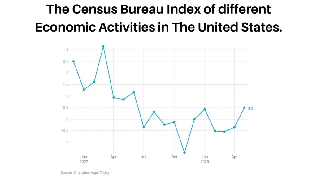 (Source: census.gov)
- March 2022: The index stood at 3.15, indicating a positive economic activity level.
- April 2022: It significantly dropped to 0.94.
- May 2022: The index further decreased to 0.85.
- June 2022: It rebounded to 1.16, showing improved economic activity.
- July 2022: There was a decline, with the index falling to -0.35.
- August 2022: It slightly recovered, reaching 0.31.
- September 2022: Another dip occurred, with the index at -0.24.
- October 2022: A minor decrease to -0.13.
- November 2022: A significant decline, with the index dropping to -1.45.
- December 2022: The index leveled off at 0, showing no change in economic activity.
- January 2023: It showed a small positive movement, reaching 0.43.
- February 2023: A decrease to -0.52.
- March 2023: A further drop to -0.55.
- April 2023: The index remained negative at -0.35.
- May 2023: It rebounded to 0.5, indicating improved economic activity.
These values represent the fluctuations in the Census Bureau's index, reflecting changes in economic activities in the United States during this period.
U.S. Indicator Infographic Statistics
- Applications for new businesses increased by 0.4% to 436,048 in May.
- Total business inventories for April were $2,543.8 billion with an increase of 0.2%.
- In April, the products and services trade imbalance with other countries reached $74.6 billion.
- Retail and food service sales totaled $686.6 billion in May.
- A seasonally adjusted annual rate of 1,631,000 private home starts was recorded in May.
- Sales of food and retail industries totaled $686.6 billion.
- Seasonally adjusted net income after taxes for manufacturing businesses was $230.5 billion in the first quarter.
- Total revenue for selected services in the first quarter was $5,201.3 billion.
- April saw a $2.6 billion gain in new orders for manufactured products.
- The total cost of construction in April 2023 is $1,908.4 billion.
- The goods trade surplus in advance grew to $96.8 billion.
- The 1st quarter of 2023 saw a higher rental vacancy rate than the 1st quarter of 2022, at 6.4%.
- The 1st quarter of 2023 saw a 66.0 percent homeownership rate which is similar to the 1st quarter of 2022.
Infographic Statistics by Types Section
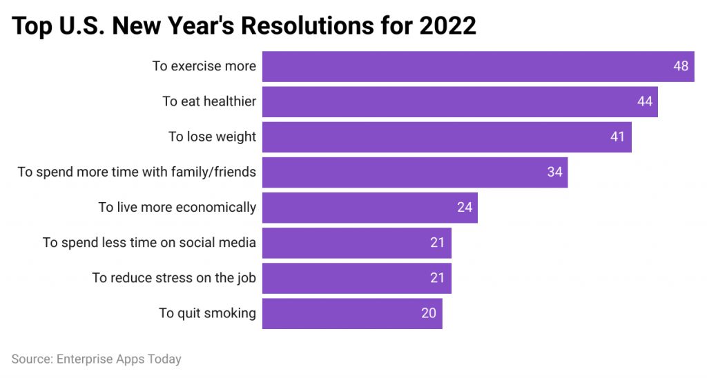
(Source: statista.com)
- The graph represents the U.S. resolution for the New Year.
- As of 2022 New Year's resolutions have been made by 39% of American adults.
- 48% focused on doing more exercise and only 20% planned to quit smoking.
- According to Statista, One out of five individuals stated they wished to use social media less.
- While 4 out of 10 individual respondents planned to lose weight and eat healthier.
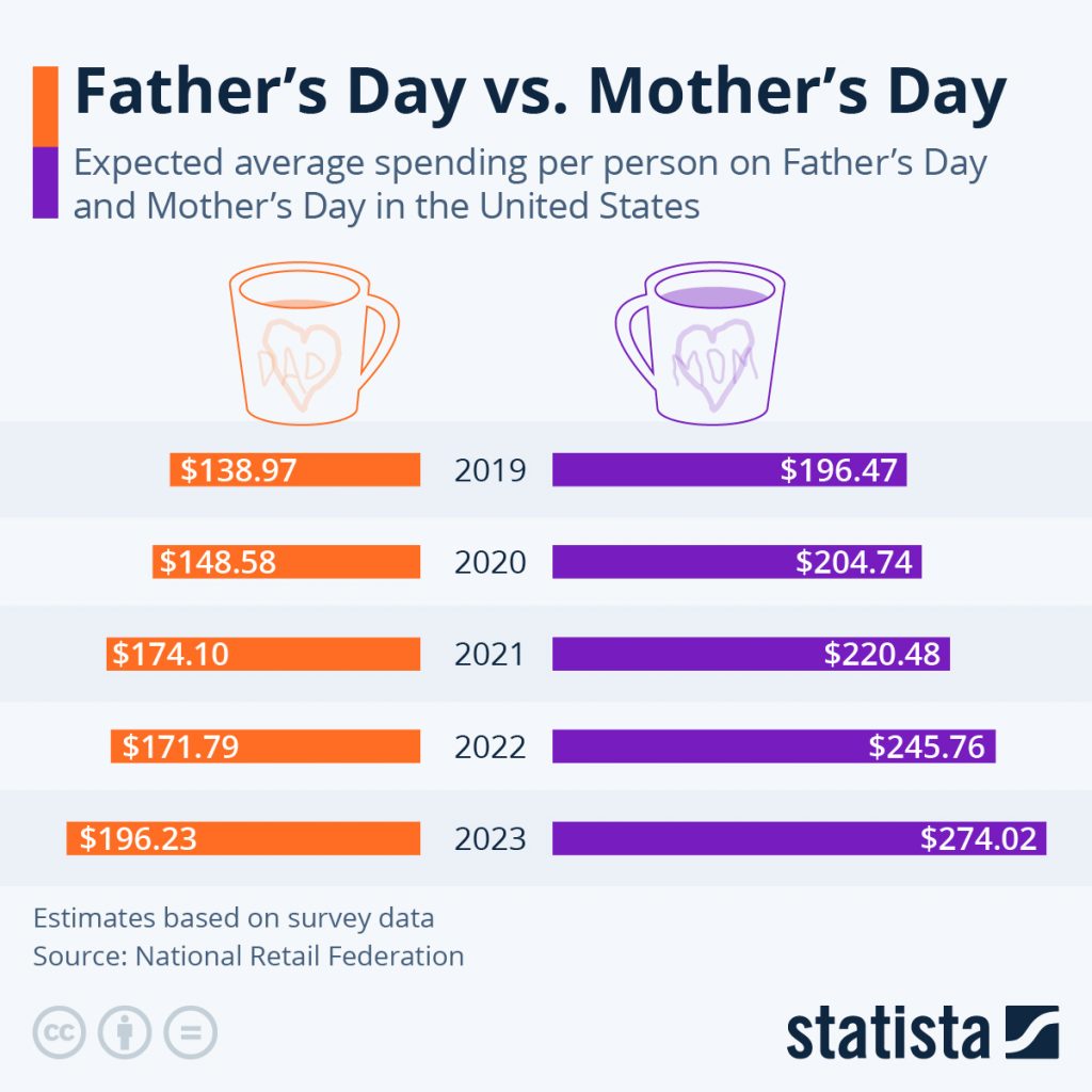 (Source: cdn.statcdn.com)
- The above graph describes the average spending of U.S. people on Father’s Day (orange) and Mother’s Day (purple).
- In 2022, the spending on Father’s Day was $171.79 / per person, and on Mother’s day $245.76 / per person.
- As of 2023, spending on fatherhood in the United States is expected to a new high of $196.23 / per person with a total of $22.9 billion. Whereas, on motherhood spending per person is expected to be $274.02 with a total of $35.7 billion.
 (Source: cdn.statcdn.com)
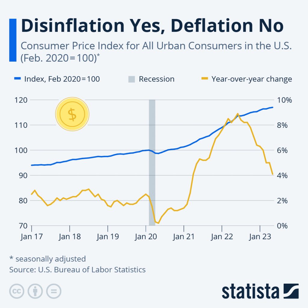
- The above graph describes the inflation (yellow line) and consumer price index (blue line) of the United States in 2022-23.
- The inflation rate peaked at 8.9 percent in June 2022, which has significantly increased since last year.
- As of 2023, the rate decreased to 4%.
- However, consumer prices are still rising and are currently 17% higher.
 (Source: upload.wikimedia.org)
(Source: usnews.com)
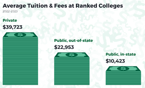
- Private National Universities' tuition and fees have increased by 134%.
- Government National Universities outside the United States tuition and fees have increased by 141%.
- Government National Universities' in-state tuition and fees have increased by 175%, which is the greatest growth.
 (Source: cdn.brewersassociation.org)
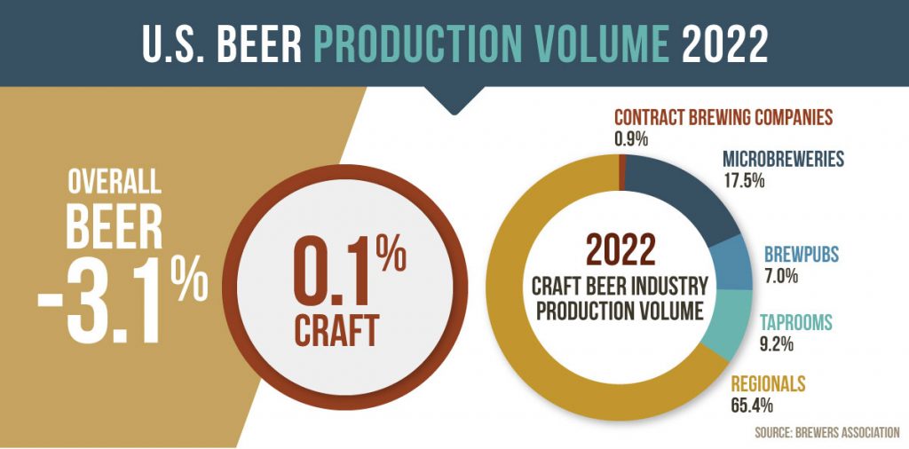
- The above image depicts the infographic representation of U.S. beer production in 2022.
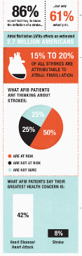 (Source: columnfivemedia.com)
- The above graph represents the information design of Atrial Fibrillation in the U.S.
U.S. Holiday Shopping Infographic Statistics
- In 2022, U.S. holiday-quarter retail sale was $1.33 trillion in online sales covered 24% with $0.32 trillion.
- 82% of American people planned to purchase holiday gifts via online search platforms but only 74% of people purchased gifts in August 2022.
- October-December is termed as the holiday season in which the total online sales growth has digitally accelerated to 20% and retail sales decreased to 6% in 2022.
- By the end of 2022, the performance of cyber five resulted, in a 3.9% YOY growth on Thanksgiving was $ 5.3, a 2.2% YOY growth on Black Friday was $9.1 and a 5.6% YOY growth on Cyber Monday was $11.3
Content Marketing Infographic Statistics
- In 2023, short-form video is expected to have the greatest growth and is the most popular trend among marketers.
- 90% of advertisers are using short videos that will boost or maintain their business investment in 2022.
- According to 32% of marketers, visual images are the most significant type of content for their companies.
- For enhancing brand values almost 30% of marketers have created visual content.
- 43% of content marketers claimed that producing visual materials or infographics regularly is a huge challenge.
- 42% of U.S. people take the opinions of others before making purchases, and they prefer suggestions from trusted sources of infographics.
- As of 2023, content relatable and trends are important factors, in which 46% of marketers are going to implement it for the 1st time, 49% are expecting to increase their investment and 43% maintained consistency.
- Original images or visuals reportedly boosted engagement in marketing campaigns by 40%.
Important Statistics
- According to a recent survey, out of the 500 marketers surveyed in the U.S. 56% said they always included images in their marketing content.
- Original infographics were recognized as the most effective content kinds to use in content marketing by 40% of those surveyed in America.
- Videos and presentations were considered to have performed the best by 23% of U.S. marketers.
- 65% of people said visual information is much simpler to remember.
- 30% of American people feel more comfortable making payments easily when visuals are properly implemented.
- Colored visual contents are more likely to grab attention by 82%.
- In the healthcare sector when patients receive health stats with proper infographics helps them to understand their physical condition by 2.84 times.
- 39% of colored information is more eye-catching and easy to remember than black-and-white content.
- In comparison to the content without pictures but with visuals businesses completed their work by creating a 15% productivity increment.
- In the case of finding effective information from any document proper visuals, charts, and colored images helped to reduce 39% of the time.
- Researchers discovered an 80% reduction in errors when colored images were used to illustrate a task.
- Utilizing data visualizations increases an organization’s likelihood of finding the data it needs for significant projects by 28%.
- When color is used in visuals, reading comprehension improves by 70%.
- 78% of visual infographics helped in enhancing the learning process and information retention faster in 2022.
- Human brain processing uses 50% of visual
Conclusion
After covering the article on infographic statistics, it can be stated that this has already become an effective tool for understanding and analyzing information as well as huge amounts of data within less time. This is a type of visual presentation designed to draw the viewer’s attention and enables improved understanding. These days, people are more attracted to visual aspects that catch their attention because 90% of the information that reaches our brains is visual and even 87.5 % of U.S. marketers have started blogging with these statistics resulted beneficially. Thus all other statistics mentioned above in the article, hope will help in better understandability.
FAQ.
There are three different categories are termed as data visualization, information design, and editorial infographics. Firstly data visualization is the easiest way to portray informative data. Next, the branch of graphic design is known to be information design which is based on the effective and efficient presentation of information. Lastly, simple bars, lines, and pie charts are used in editorial infographics which are required for illustrating complex topics.
Charts, statistics and visualized images and data along with the use of exact information, source, color, negative spaces, universal designs, original contents and proper proportion make the infographic effective.
This allows in illustrating statistics, eliminates out unnecessary details and simplifying the overall process of the representation.

Barry is a lover of everything technology. Figuring out how the software works and creating content to shed more light on the value it offers users is his favorite pastime. When not evaluating apps or programs, he's busy trying out new healthy recipes, doing yoga, meditating, or taking nature walks with his little one.